◫
Modern Dashboard
Composable data panels arranged with a clean executive layout.
Cybersecurity Dashboard Concept
FMODM is a fictional UI/UX concept built for a university project. It demonstrates responsive layouts, branding, dashboard composition, visual hierarchy, motion design, and dark-interface storytelling. The presentation is intentionally static: it showcases interface ideas only and does not implement remote administration, security tooling, network features, or executable behavior.
Every interaction is designed to feel deliberate: sharp grids, luminous edges, layered glass, and restrained motion create a polished SOC-inspired aesthetic while keeping the message clearly academic and conceptual.
Composable data panels arranged with a clean executive layout.
Fluid grids and adaptive spacing maintain polish across all devices.
High-contrast reds and charcoal surfaces support the cyber aesthetic.
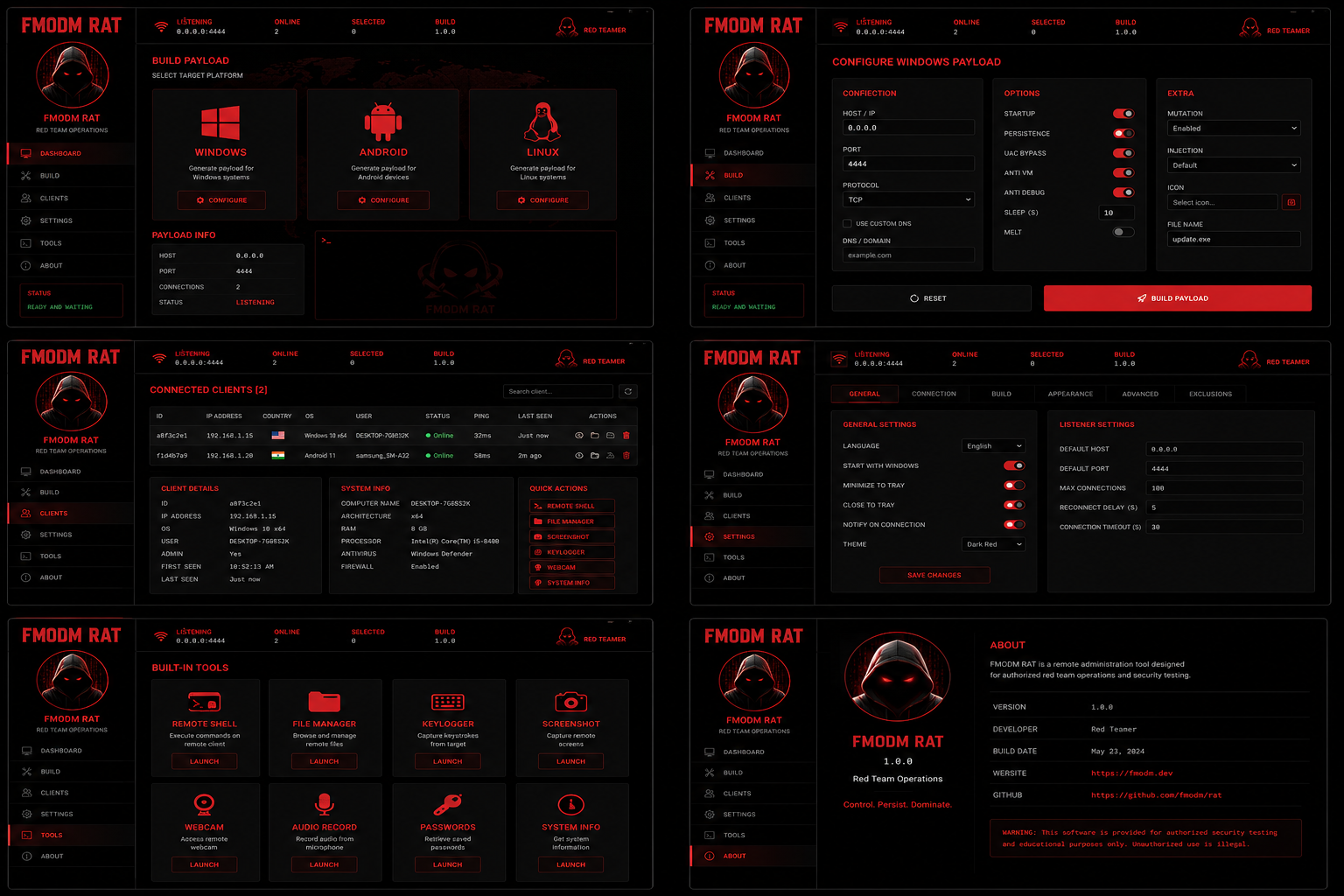
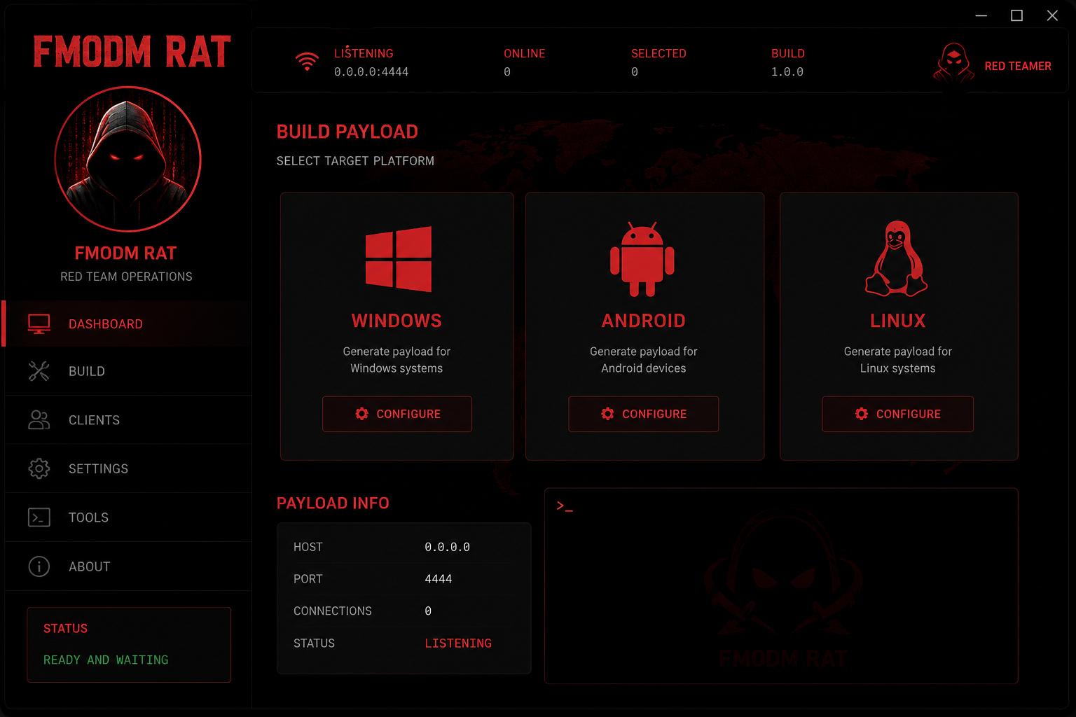
Platform cards present visual concepts for Windows, Android, and Linux.
Mock security surfaces are shown as visual design, not working systems.
Charts and counters communicate structured data storytelling.
Cards, panels, and modules can be repurposed across sections.
Animated surfaces simulate monitoring without exposing any control logic.
A polished concept tile suggesting a desktop-first experience with enterprise-level visual rhythm.
A mobile-centric concept tile balancing compact information density and strong hierarchy.
A terminal-inspired mockup emphasizing precision, clarity, and a professional open-source mood.
Investigate visual references, dashboard patterns, and the desired brand tone.
Map key content areas and define the information hierarchy for each section.
Implement the polished single-page concept with motion, glass, and neon accents.
Document how a real product might be structured without building any remote functionality.
Review responsiveness, motion restraint, readability, and composition quality.
Present the concept as a refined university portfolio and UI/UX showcase.
The two provided images are used here as part of the portfolio presentation to illustrate the dark dashboard inspiration behind the concept.
Coordinates the concept narrative, pacing, and presentation quality.
Shapes the neon-glass language and dashboard composition.
Builds the responsive one-file experience with smooth motion.
Frames the work as a university portfolio and UI/UX concept.
"FMODM feels like a premium product concept rather than a student mockup. The hierarchy, glow treatment, and motion discipline are unusually polished."
"The interface communicates enterprise confidence while staying clearly conceptual. It is visually rich without becoming noisy or cluttered."
"The cyberpunk treatment is consistent across sections, and the information layout reads like a well-crafted dashboard brand system."
Use this section as a university presentation placeholder. The form is purely decorative and does not submit anywhere, keeping the project aligned with the requirement that it remain a non-functional concept showcase.